
I’m a big fan of the default brushes offered by Procreate. I will probably stick with this amazing set, and never spend any money buying brushes. I would probably create my own instead: it seems to be fun and it’s easy to duplicate an existing one to tweak it for our need.
Well – I did for my WildWater logo (stamp) and it was very easy… I will do a post about this later…
🤔 I was wondering: what could be my first post? Today I was feeling just good enough to lay in my bed and think about it. Then I did setup my blog home page… and I had to select an image for my home page… this little bird was the winner!
The little bird: Steps
I first used the Painting collection / Gouache. You will see this one a lot since it’s one of my favorites. I use it for the first layer (background) to set the tones / decode on the the main colors.
Then, in the Inking collection, I used a mix of the Fine Tip and Technical pen to create the feathers – it’s a lot of strokes, but worth it. Selecting different shades of colors along the way will give a cool realistic effect.
I constantly use the Smudge tool with the Painting / Gouache to smooth the start of the feathers – giving this fluffy impression.
Always keep your main piece of work (in this case, the bird) on a separate layer – allowing you to copy and paste without the background. I’m a layer-freak – I constantly duplicate to keep a copy that is invisible (can save your day) and when I start a new element (i.e. the eye or the beak) I start on a new layer first, then I merge when I’m satisfied.
The patterns
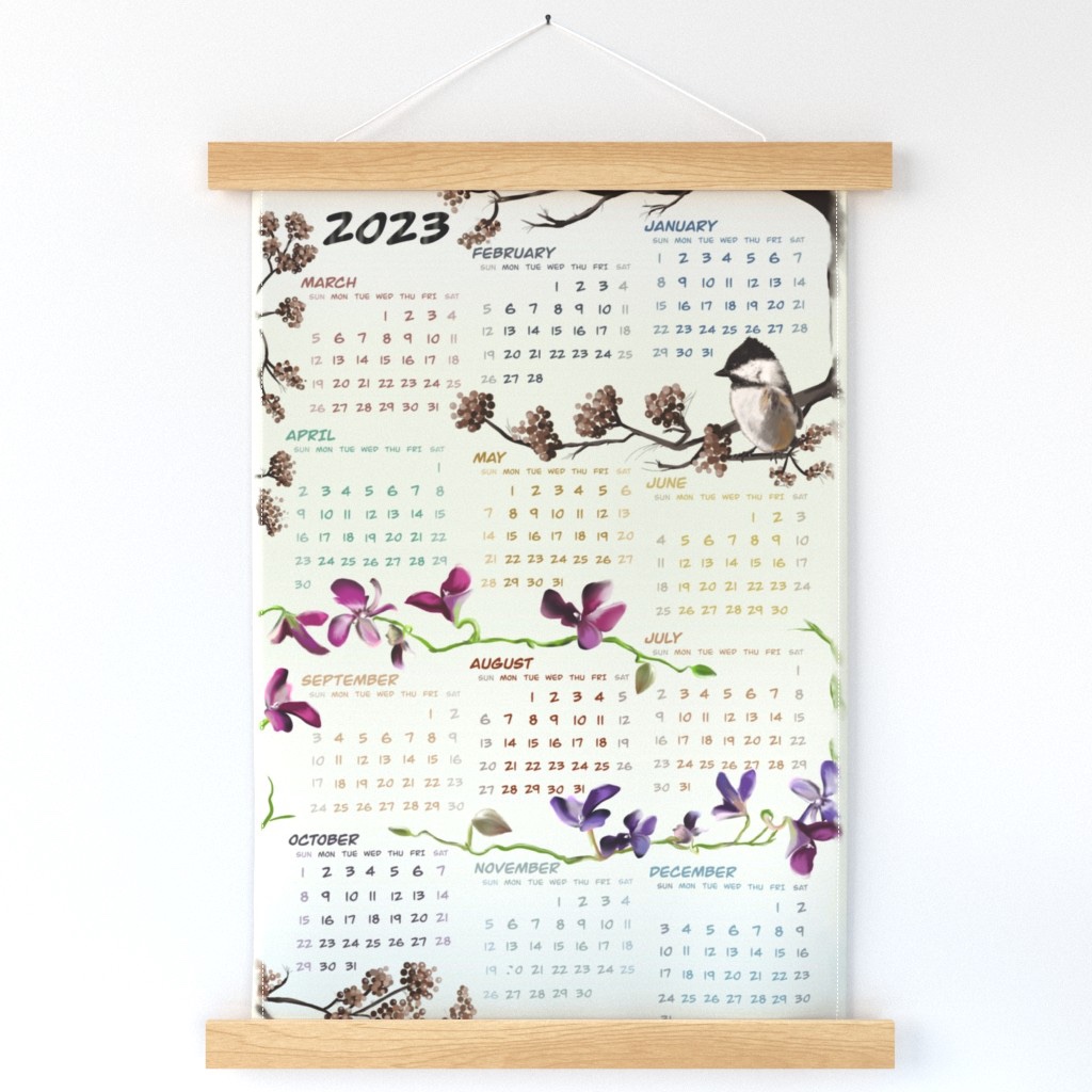
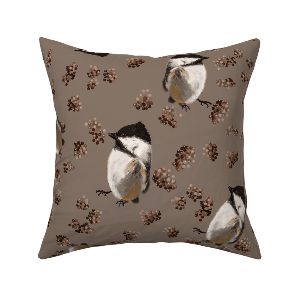
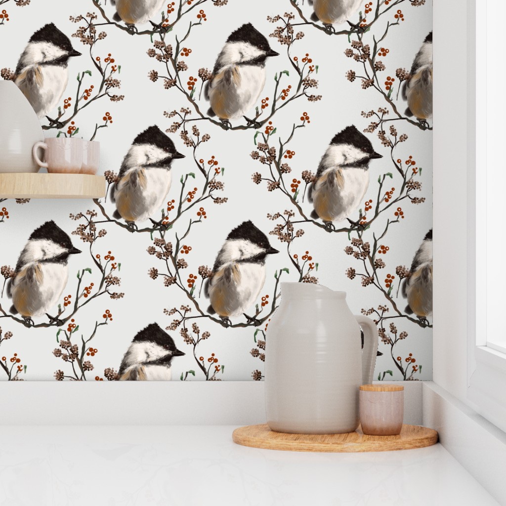
Now – how to offer this bird on Spoonflower? I first made a random placement that you will find below ⬇️ (I found the background very dark and I may replace this dark brown with soft white cream color). Then I made a calendar, and a wonderful Damask (I plan to do another post about Damask… they are complex but so beautiful!
You can find the collection here
Hope you like my chickadee ❣️😄🎨


Leave a comment